Role & Responsibilities: Lead UX Designer
Team size: 4 (Worked with a UI Designer)
Tools: Figma, Mural, JIRA, Slack
Timeline & Scope: 8 weeks
OVERVIEW
The New Mexico Economic Development Department was recently awarded an Economic Development grant. providing them crucial resources to develop a long term state wide economic development plan and roadmap to ring new business to New Mexico and help grow existing business in the state.
KEY STAKEHOLDER DISCOVERY
01 Interviews
To begin 4 individual members of NMEDD’s senior leadership, core project team and 2 SRI members were interviewed . remotely via Zoom. We will covered topics including, but not limited to, the following: organizational strategy, vision, executive and division goals, project limitations, organizational culture, user profiles, pain points, data sets, best case outcomes, and measures of success.
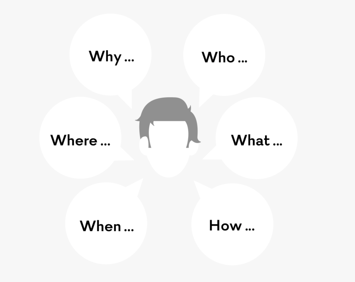
My script included questions that began with who, what, when, where, why and how, such as “What role did you play in developing the plan?,” “What are the most important parts of the plan?,” "Who will benefit most from this new landing page?,” and “How will the landing page extend or improve the impact of the 20 year plan.”
Discovering Trends
From the 4 interviews, I wrote down the most important points on google docs then began mapping on Mural to help organize and synthesize data to better reveal patterns. The main topics from the data were about the economic plan, landing page and audience.
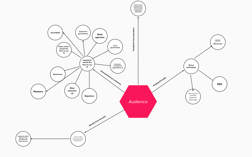

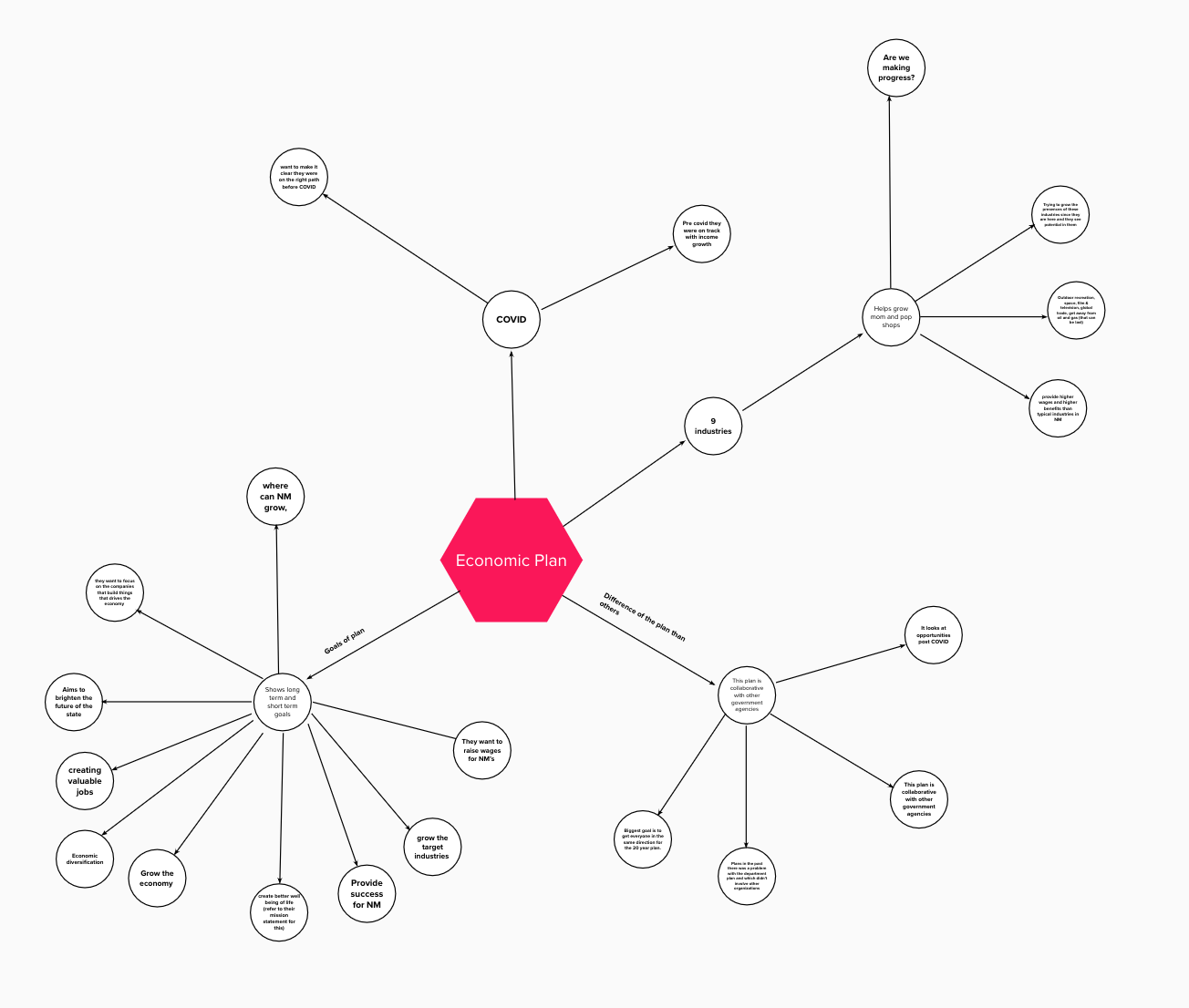
Interview Insights
From the map above I discovered the following below:
1. The goals/benefits of the economic plan
2. The department wanted to provide success to NM by growing the economy
3. Create valuable jobs/ a better living for families in NM through their 9 key industries
4. They wanted to raise wages in NM
5. Create economic diversification
6. Look at opportunities past COVID and the progress they have made pre COVID
7. Give users a sense of direction with resources
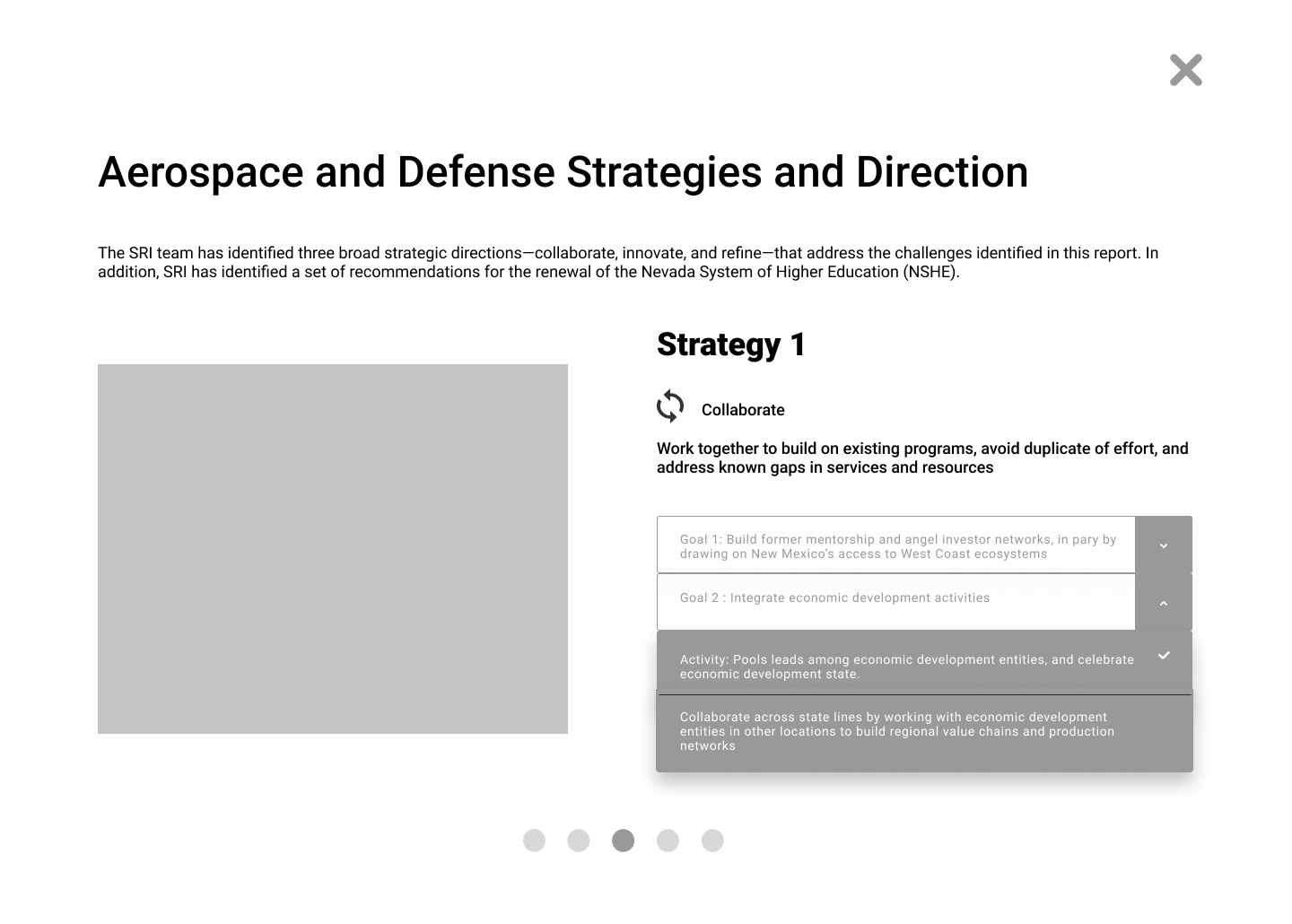
8. Display the strategies per industry
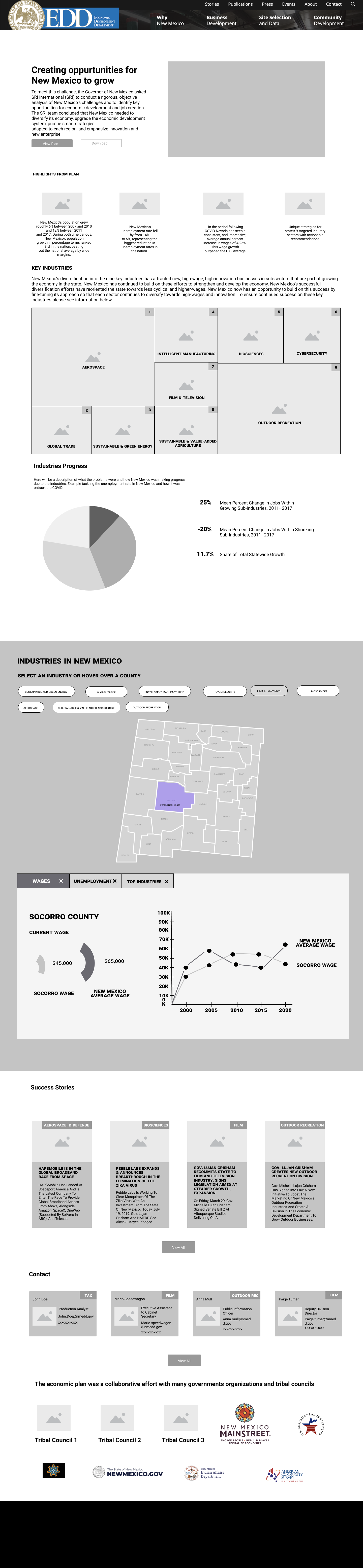
RESEARCH FINDINGS
Sketches
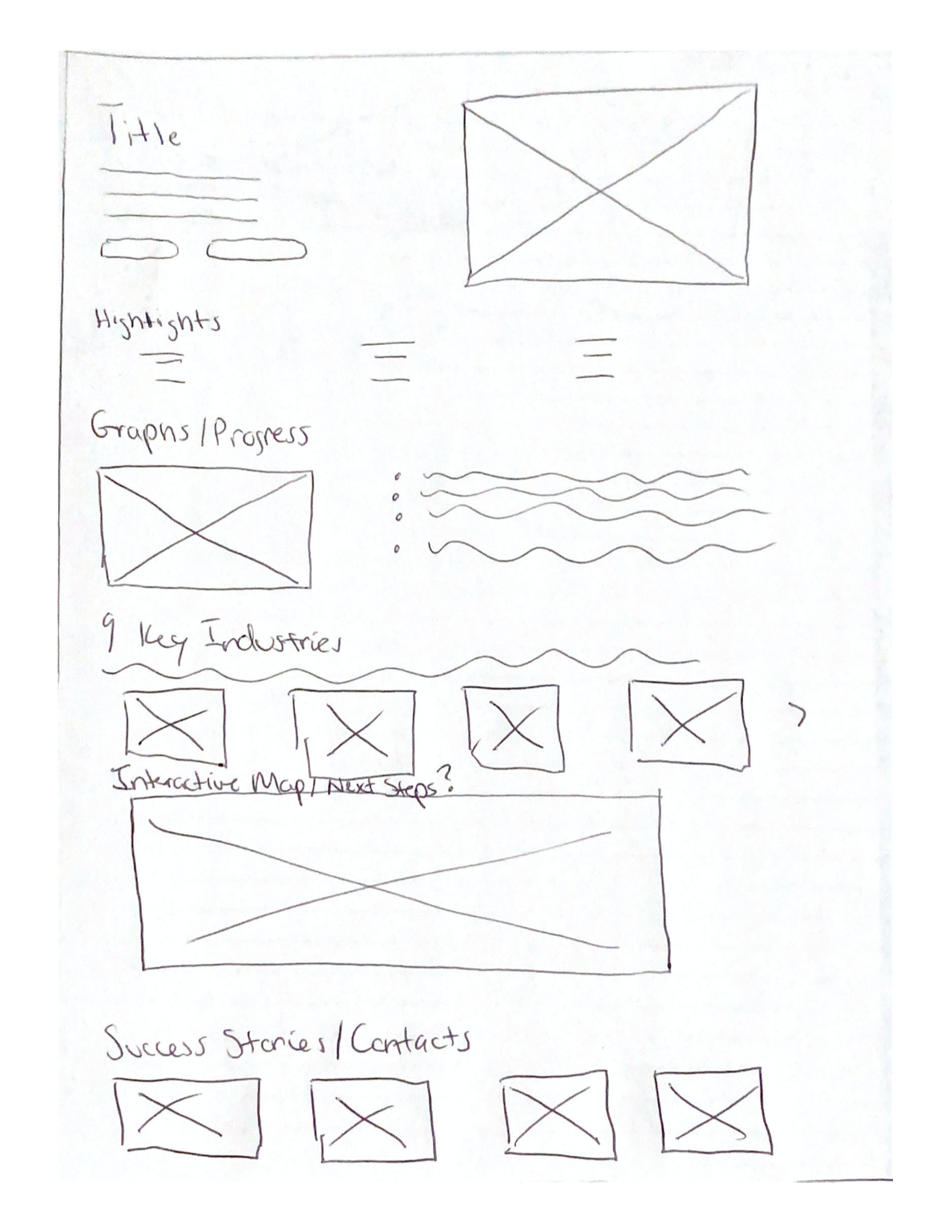
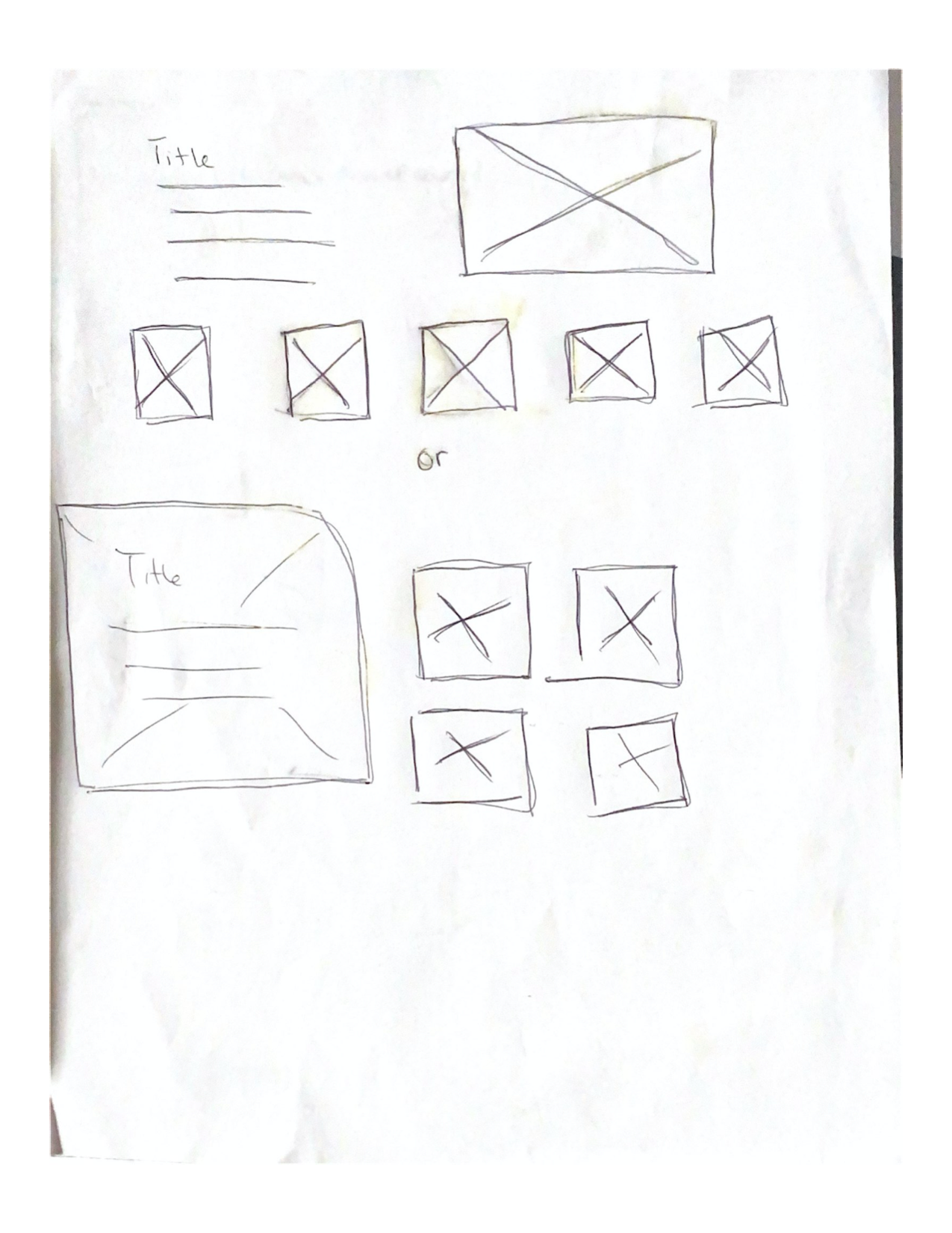
Low Fi


Mid Fi

User Testing
Once the Mid fi were complete and functional enough to user-test, users were asked if they had 30 minutes to try out the new landing page I was testing. At the start of each test, I asked them if it would be okay to record the conversation for testing purposes only, to which they agreed.
In all the tests, I had written out a script of objectives for each category beforehand which were as followed:
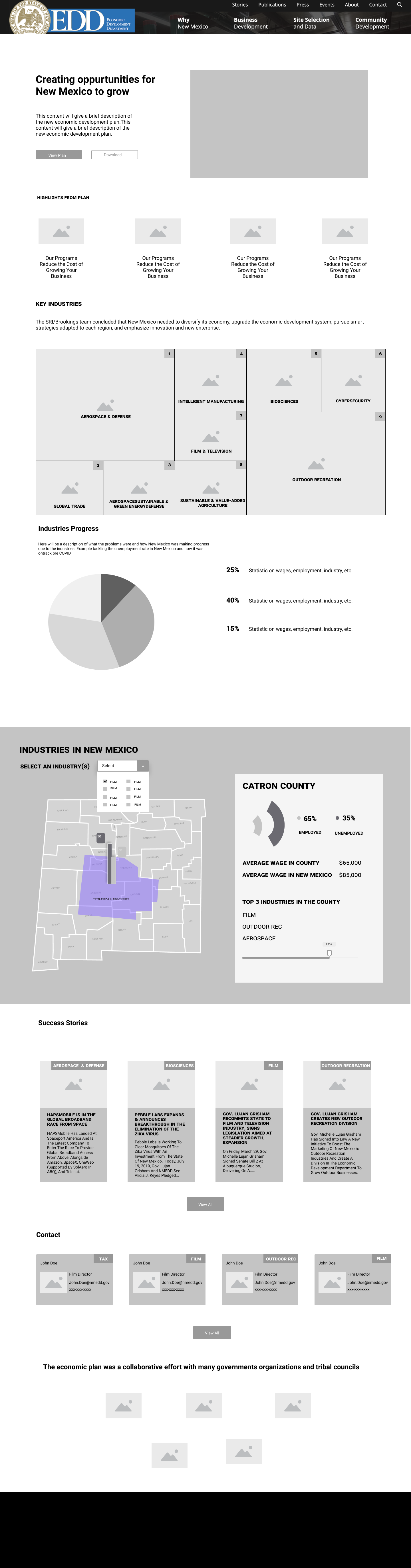
Home page
What is this page?
Where would you find the industries on this page?
Where would you find who worked on the economic plan?
The Plan
Where would you click to the view the plan?
How would you download it?
Where would you find the highlights of the plan?
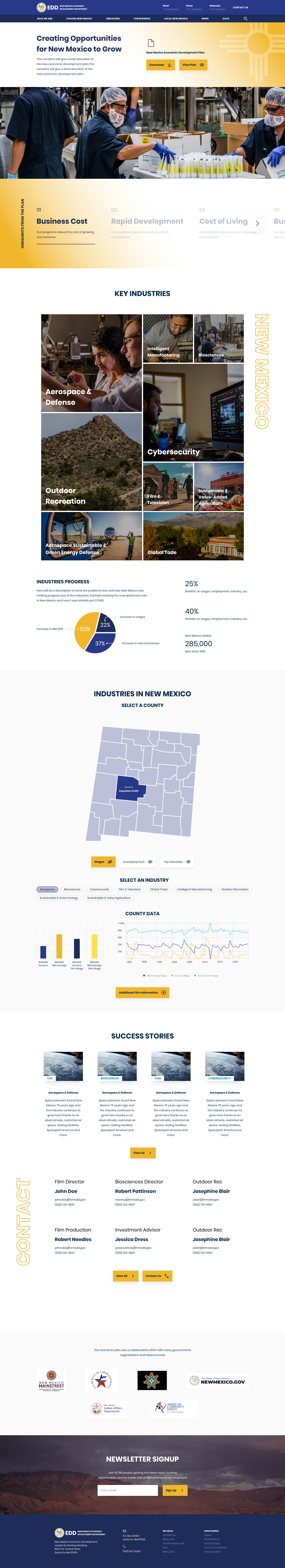
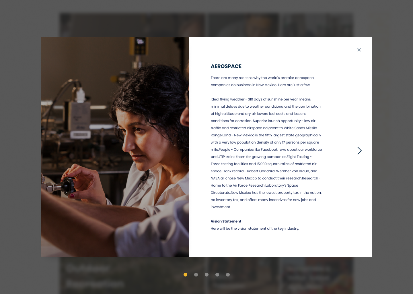
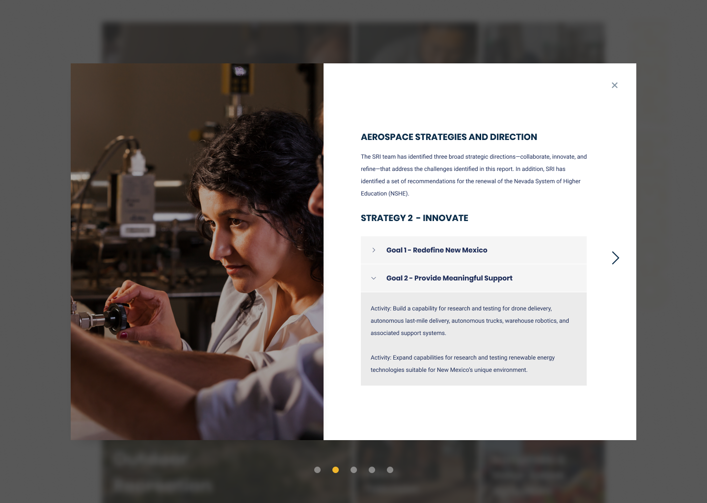
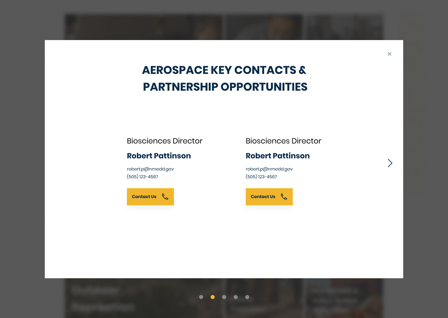
Industries
Are you able to find the strategies?
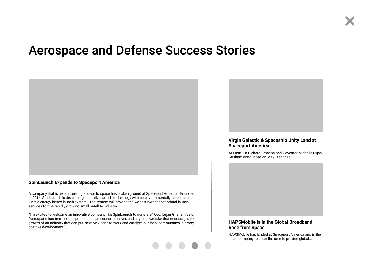
How would you find the success stories?
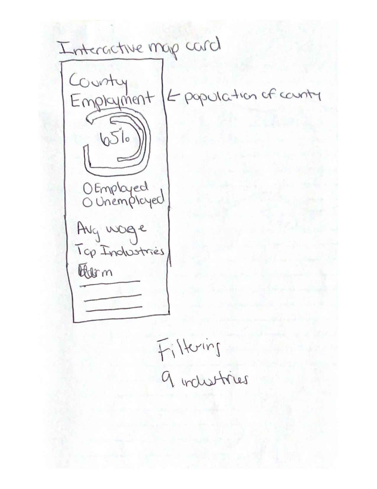
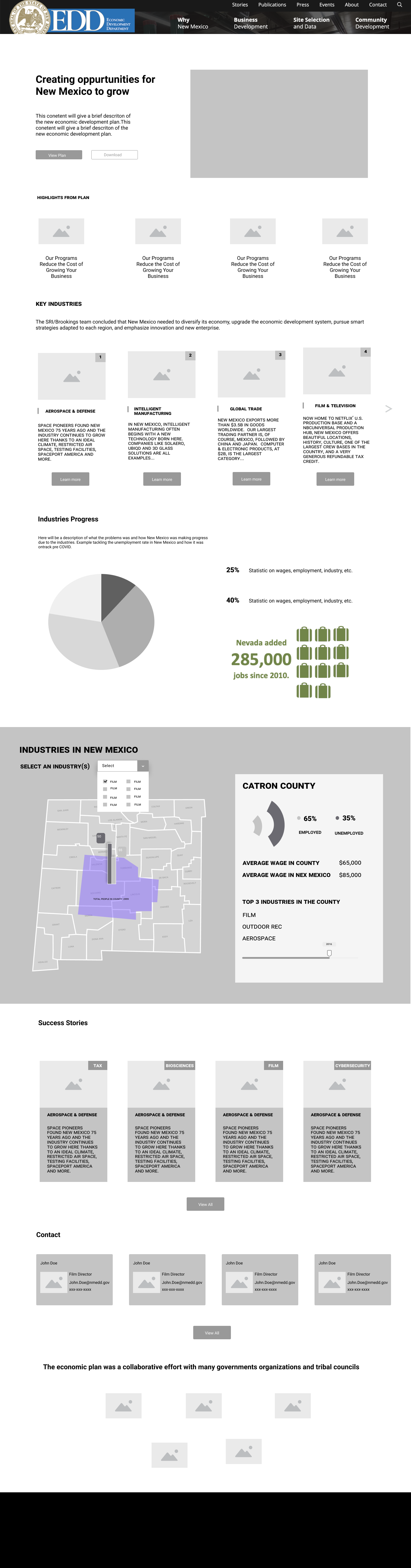
Map
Are you able to distinguish how many people are employed/unemployed?
Are you able to find what are the key industries in a county?
Are the tabs helpful when looking at more than one county?
A/B Testing
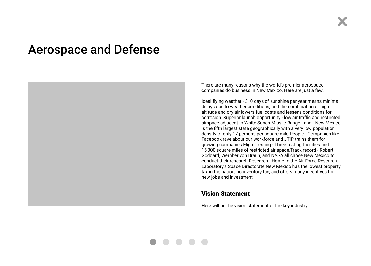
When creating the Mid fi there were two versions on how to display the key industries. mosaic and and standard horizontal scroll were the two versions that were being tested. Users agreed that the mosaic view was more helpful to get information from.

Findings
In observing the users during the testing and in the video recordings seen afterward, I got some very actionable feedback.
1. In the tests, users responded better to the mosaic view as the best way to display the key industries.
2. The timeline on the map was confusing.
In conclusion, users found the information helpful and easy to find but the map had to be refined.
Iterations
User Testing Round 2
In observing the users during the second round of testing, more feedback was given in order to make the landing page more user friendly.
1. Adding a CTA on how you can collaborate with other organizations/partnerships
2. Seeing you competitors markets and how you compare
3. Adding an emailer list for those who download the plan in order to keep track
Final Design