Disclaimer: Some information in this case study has been modified or generalized due to sensitive content and confidentiality requirements associated with government projects.

01. OVERVIEW
E-EFMP Command Center
Creating an actionable dashboard experience for military families
E-EFMP supports Service Members, Family Members, and staff as they navigate complex enrollment and assignment processes. Research identified a major gap in the logged-in experience: users lacked clear guidance on their status, responsibilities, and what they needed to do next.
Our goal was to transform the logged-in homepage into a personalized Command Center that surfaced the right information and helped users take action quickly.
Role: Product Designer
Industry: Government / DoD
Team: Lead Designer, Product Designer, Business Analysts, Stakeholders & Developers
Responsibilities: Research Synthesis · Collaborative Ideation · Wireframing · UI Design · Prototyping · Design System
Industry: Government / DoD
Team: Lead Designer, Product Designer, Business Analysts, Stakeholders & Developers
Responsibilities: Research Synthesis · Collaborative Ideation · Wireframing · UI Design · Prototyping · Design System
02 — The Problem
Turning a static homepage into an actionable experience
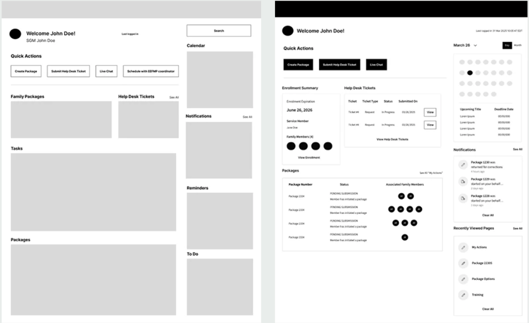
The existing logged-in experience prioritized static information and resources, making it difficult for users to understand what required their attention, where their packages stood, and what they should do next.
We needed to answer a simple question:
How might we create a personalized Command Center that helps users understand what matters and take action quickly?
03 — Research & Discovery
(Collaborative Dashboard Brainstorming)
Understanding what users needed after login
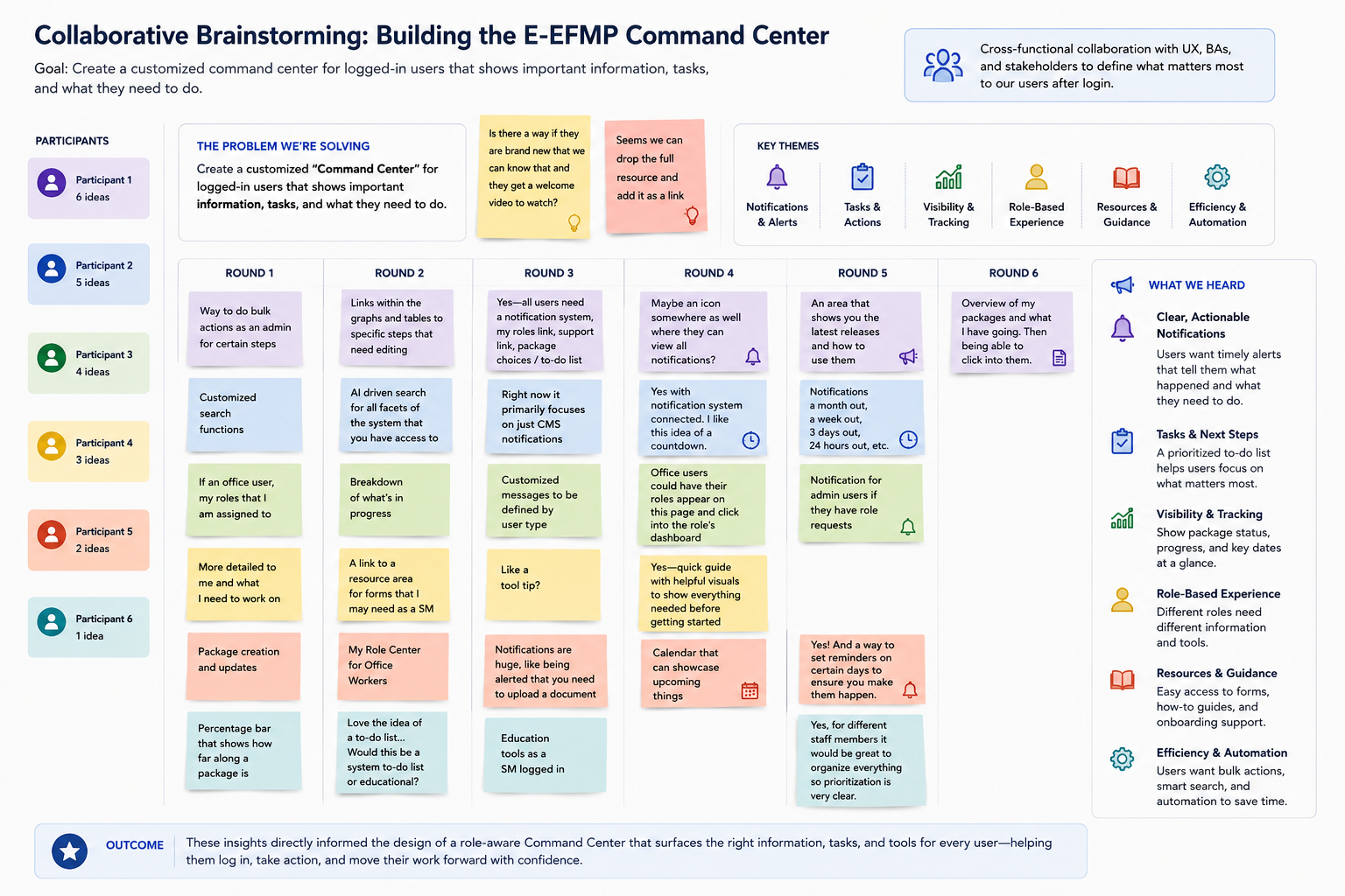
Before redesigning the E-EFMP dashboard experience, I collaborated with UX designers, business analysts, product stakeholders, and subject-matter experts to understand what different users needed immediately after entering the platform.
Through collaborative brainstorming, workflow mapping, and analysis of existing user needs, we explored how the dashboard could evolve from a general landing page into a role-aware command center focused on tasks, package progress, notifications, and support.
04 — Understanding Our Users
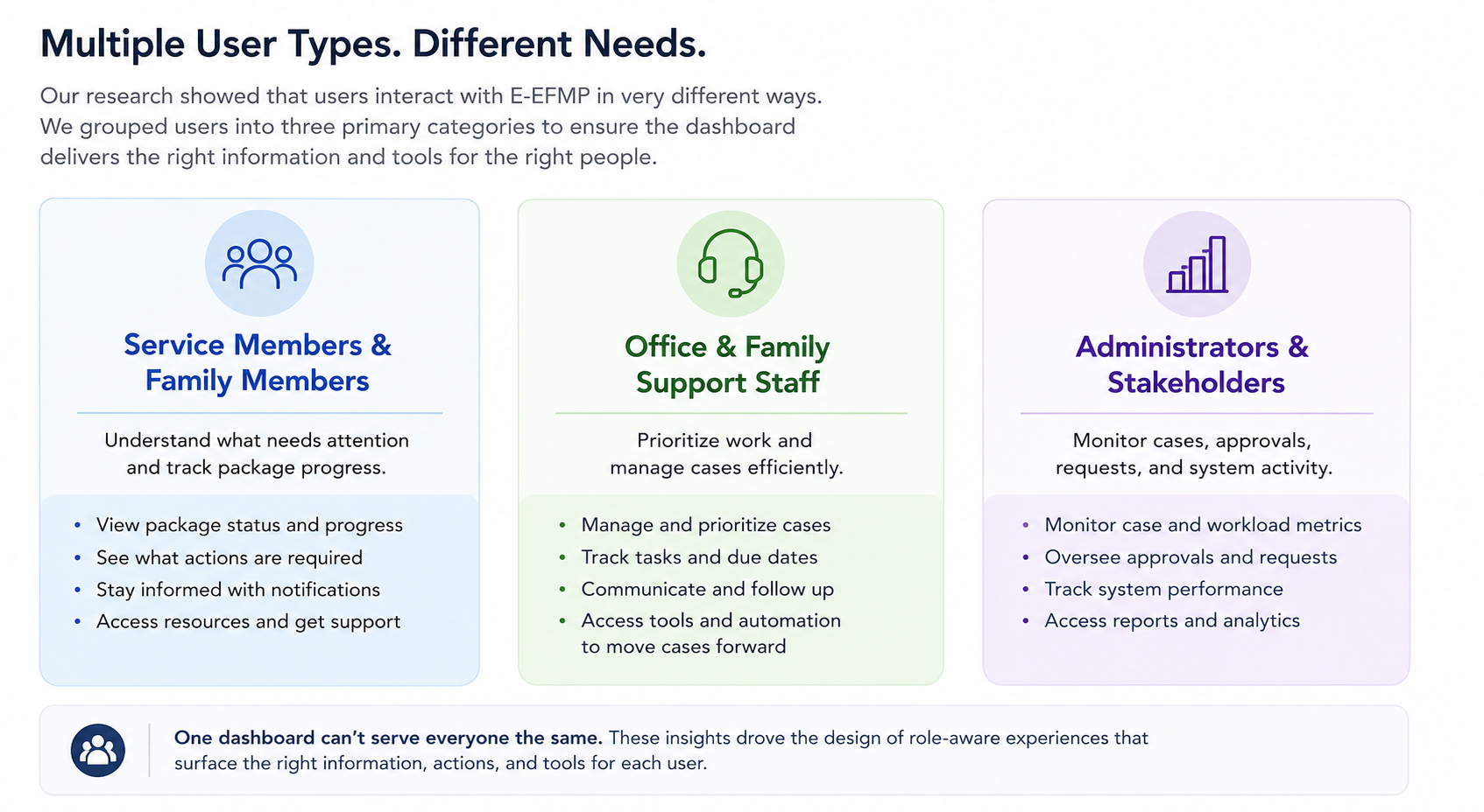
E-EFMP supports a diverse set of users with different responsibilities, goals, and levels of familiarity with the system. Research revealed three primary user groups: Service Members and Family Members, Office and Family Support Staff, and Administrators and Stakeholders. Each group needed different information and actions surfaced on the dashboard, reinforcing the need for a role-based experience rather than a one-size-fits-all solution.
05 — Key Insights
Through collaborative brainstorming, workflow mapping, and analysis of user needs, several recurring themes emerged that helped shape the dashboard experience.
01 — Users Needed Better Visibility
Users often lacked clarity around where their package was in the process, who was responsible for it, and whether they needed to take action. Making package status, progress, and next steps more visible became a key priority.
02 — Notifications Needed to Be Actionable
Users didn't just need more notifications—they needed to quickly understand what happened, why it mattered, and what they needed to do next. This led us to prioritize clear alerts, task statuses, due dates, and direct paths to required actions.
03 — Different Roles Had Different Priorities
Service Members, Family Members, support staff, and administrators interacted with E-EFMP for very different reasons. The research reinforced the need for a role-based experience that surfaces relevant tasks, information, and tools based on each user's responsibilities.
04 — Users Wanted to Complete Tasks Quickly
Many users approached E-EFMP with a specific goal and wanted to log in, understand what required their attention, complete the task, and move on. This influenced our focus on prioritization, simplified workflows, and surfacing important actions directly from the dashboard.
05 — New Users Needed More Guidance
Users unfamiliar with E-EFMP could struggle to understand the process, required documentation, and where to go for help. We identified opportunities for onboarding, contextual guidance, checklists, and easier access to support resources throughout the experience.
06. Turning Insights Into Design Decisions
These findings helped shift the dashboard from a general landing page toward a more action-oriented command center—giving users clearer visibility into package progress, prioritized tasks, notifications, support resources, and the actions most relevant to their role.
Prioritized Tasks
Surface what requires attention first.
Surface what requires attention first.
Package Visibility
Give users an at-a-glance understanding of progress.
Give users an at-a-glance understanding of progress.
Quick Actions
Reduce the number of steps needed to continue common workflows.
Reduce the number of steps needed to continue common workflows.
07 — Evolving the Concept
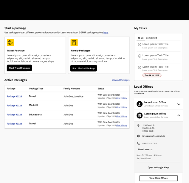
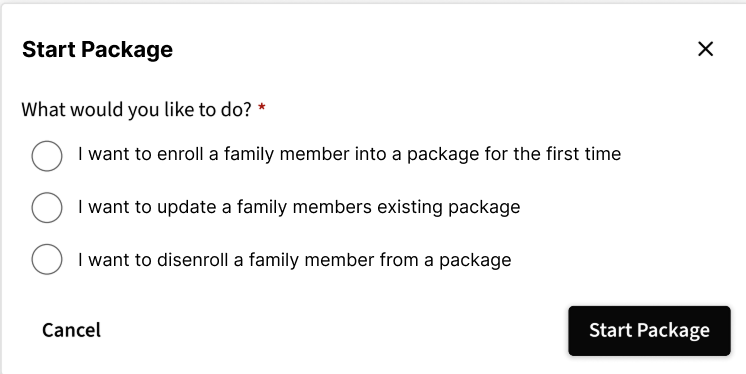
I collaborated closely with the lead designer to evolve the initial concepts into high-fidelity designs within the existing E-EFMP design system. Together, we refined hierarchy, component usage, interaction patterns, and how information would adapt across different user states.

08 — Validation & Iteration
Refining the experience through feedback
Through stakeholder reviews, we identified opportunities to simplify the dashboard and create a stronger hierarchy around the information users needed most. We iterated on the designs by reducing competing content, prioritizing key tasks, and making next steps easier to identify.
These refinements helped move the Command Center toward a more focused, actionable experience while staying aligned with both user needs and business requirements.
09 — Final Solution
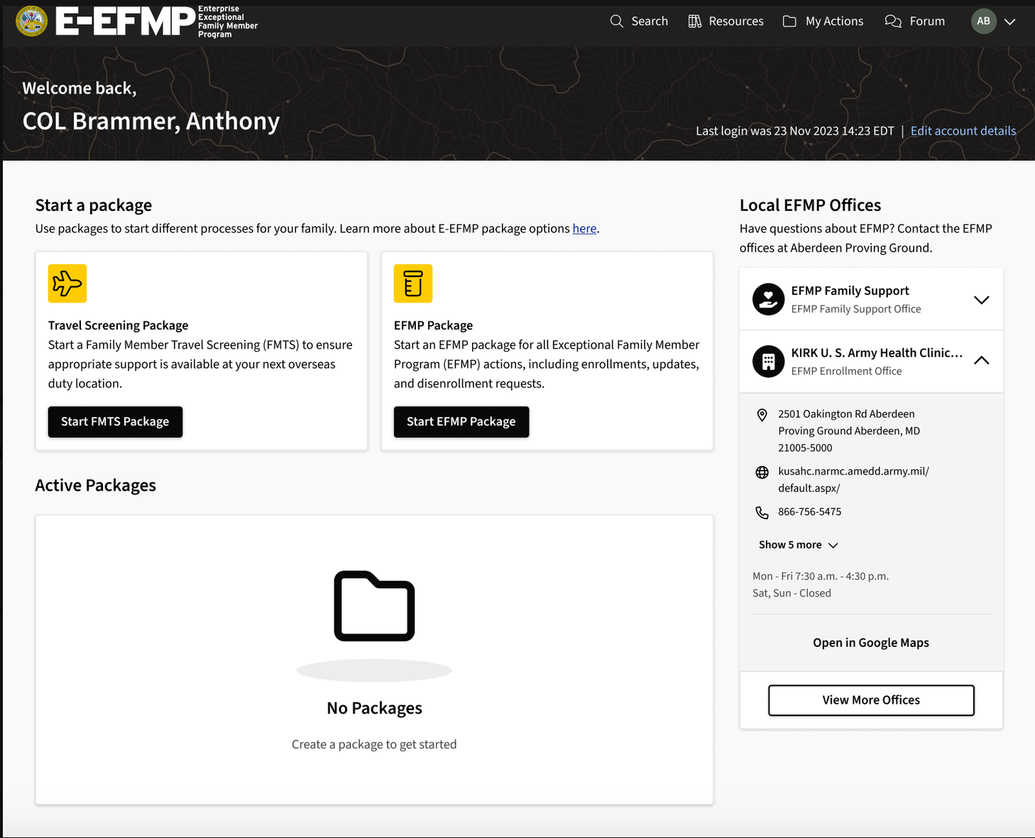
An Action-Oriented Command Center
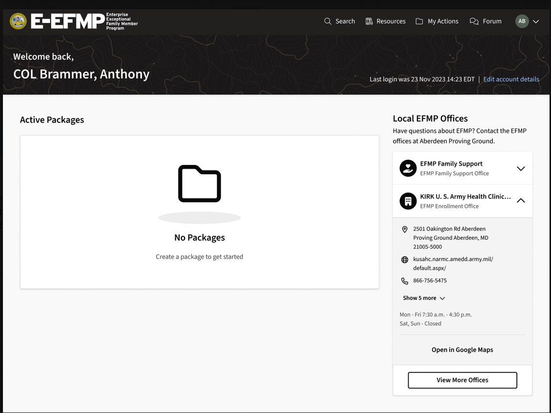
The final experience transformed the logged-in homepage into a centralized dashboard where users could quickly understand their status, identify what required attention, and continue important workflows.


11 — Design System & Documentation
Designing for consistency and scalability
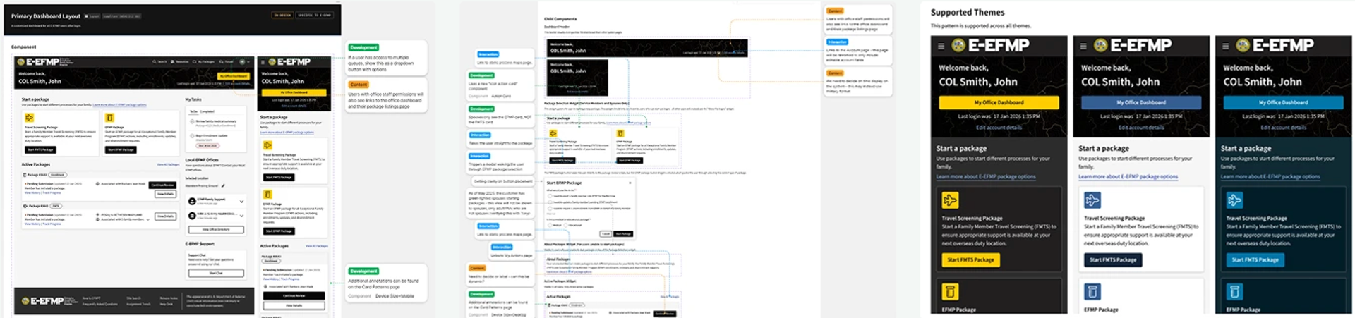
As the Command Center evolved, we leveraged the existing E-EFMP design system to maintain consistency across the experience while accounting for new dashboard interactions and responsive behaviors.
The final documentation captured desktop and mobile variants, component and interaction notes, and the design tokens used across themes, giving developers clear guidance for implementation while helping the experience scale consistently across different states and screen sizes.
13 — Reflection
What I Learned
This project strengthened my ability to translate complex research into tangible product concepts within the constraints of a government environment. Owning the initial wireframe exploration also reinforced the importance of establishing information hierarchy early—before visual design—to ensure the final experience remained focused on what users actually needed to accomplish.