Disclaimer: Some information in this case study has been modified or generalized due to sensitive content and confidentiality requirements associated with government projects.
OVERVIEW
To simplify a complex, multi-agency process for families, I helped develop a unified design system with modular, impactful features and modals. This system centralizes information, guides users step-by-step, and streamlines the enrollment experience, ensuring consistency, clarity, and ease of use across the platform
MY ROLE
In this project, I led the design of widgets and modals collaborating with product owners, developers, stakeholders, and real users to shape the experience. I drove user research, created wireframes and high-fidelity designs, and ensured the platform’s functionality aligned with both family needs and program goals. Another designer supported by refining select elements, helping polish the final product. My role ensured the tool remained intuitive, accessible, and supportive throughout a complex process
PACKAGE WIDGET WIREFRAMES
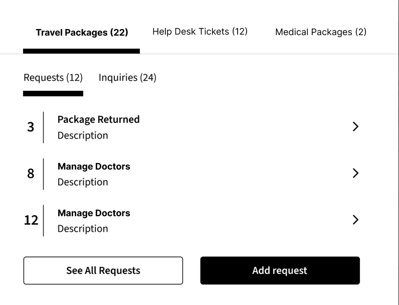
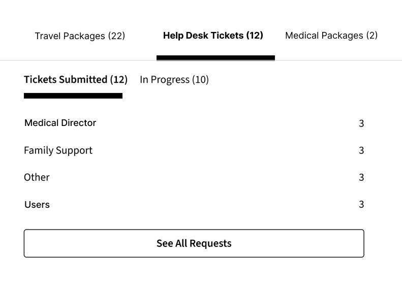
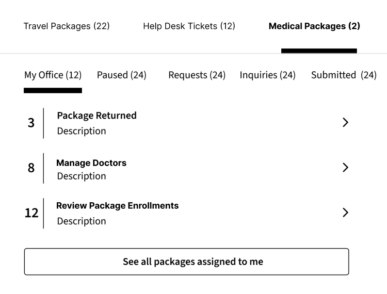
I was tasked with redesigning the package widget. I started in Figma by translating research insights and requirements provided by the product owners into wireframes
PACKAGE WIDGETS
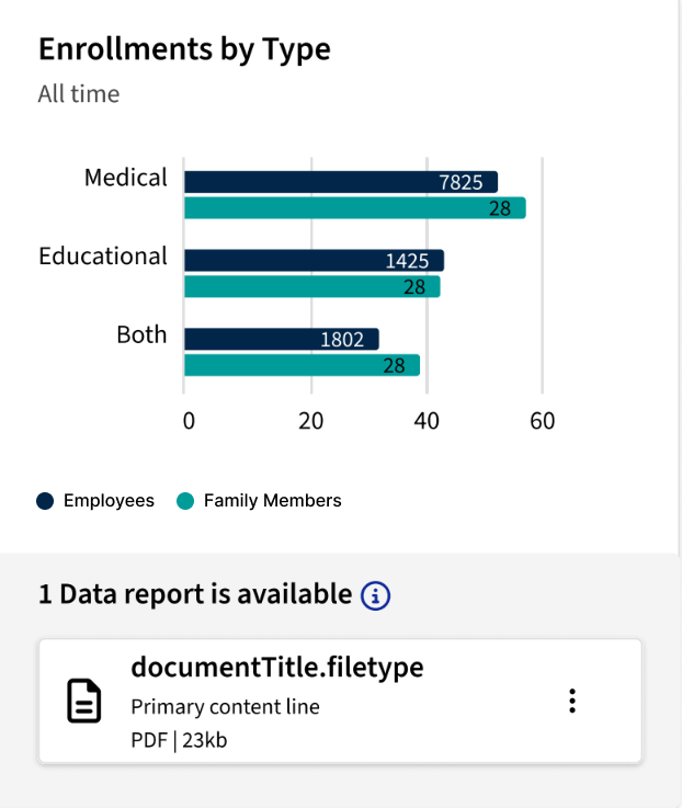
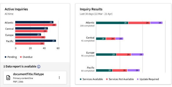
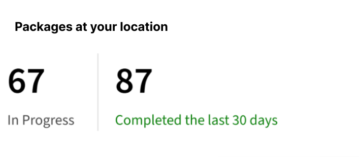
The redesigned package widget, based on official wireframes, highlights key tasks with numbered steps and clear visuals. It also includes a feature to download a PDF report of insights, allowing users to easily access and share important information
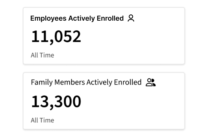
BANNER ALERTS
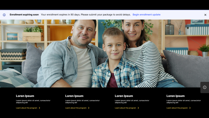
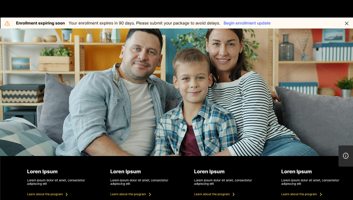
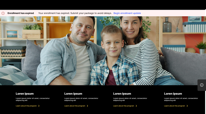
The banner alerts were designed using components from the design system to notify users of upcoming package expirations. Based on research into color usage for urgency, I updated the design system and incorporated a clear call-to-action link to guide users

EXPIRATION MODAL
Building on the expiration banner, the modal appears after clicking the link. It allows users to update their enrollment based on the expiring package, displays the type of package, and features a custom tag component I designed
PACKAGE NAVIGATION BAR
I noticed that users couldn’t easily identify who a package re-enrollment belonged to. To address this, I designed a navigation bar that clearly displays both the family member and the employee associated with the package. After exploring several options, the final design included an icon and a call-to-action button, providing clarity and actionable context for users.
